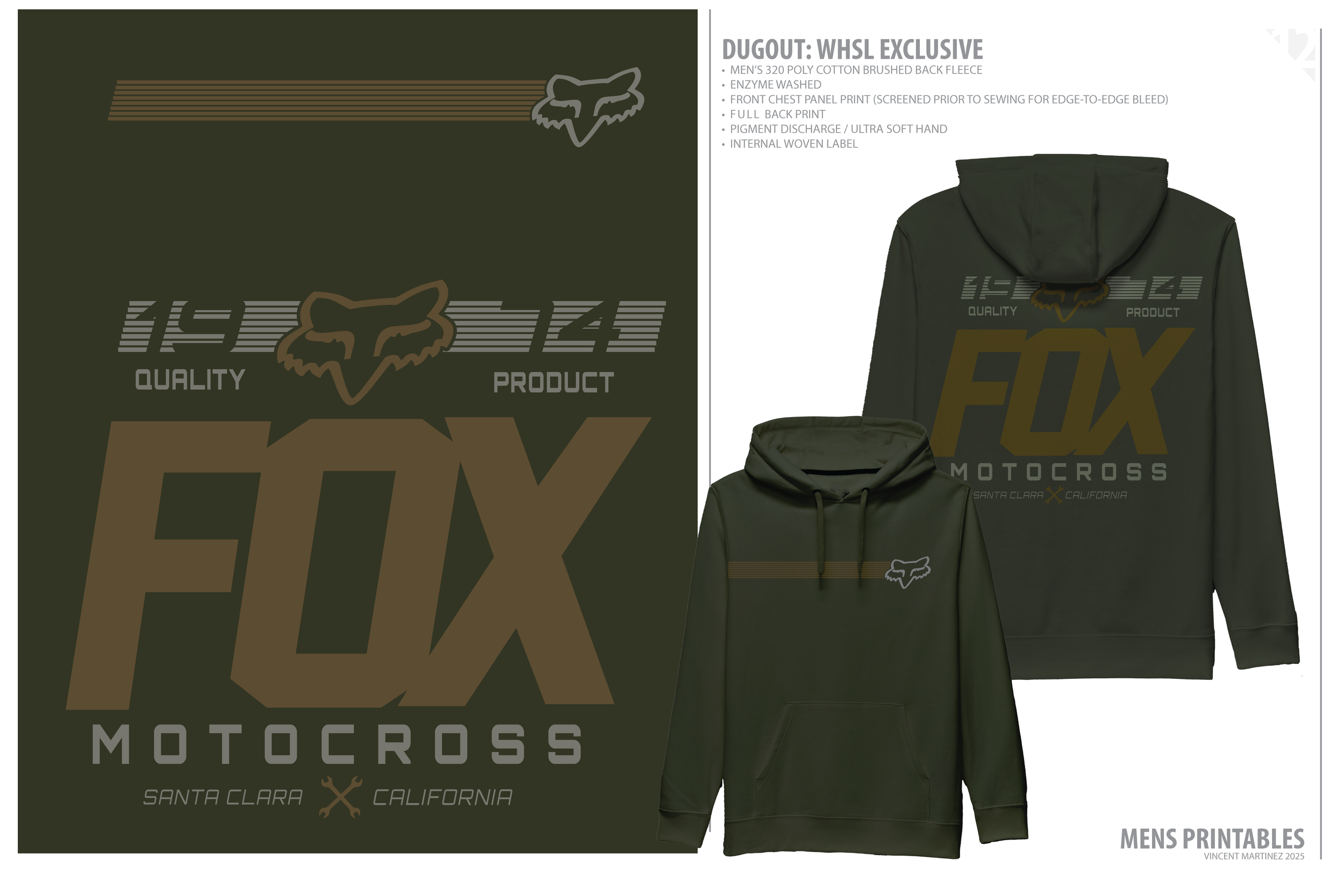
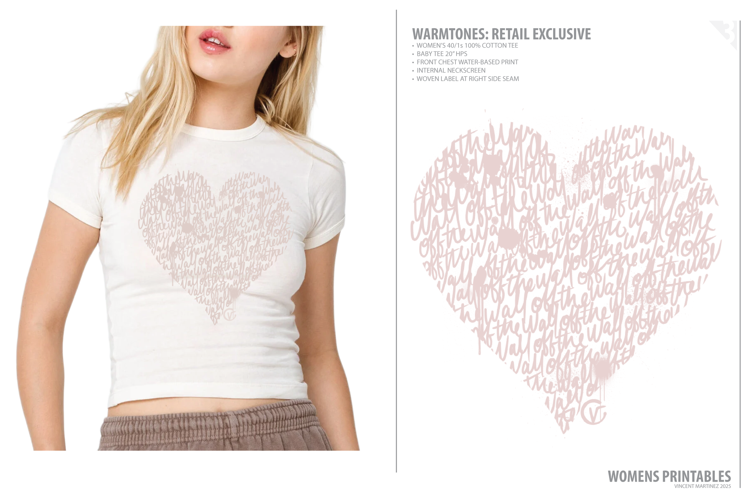
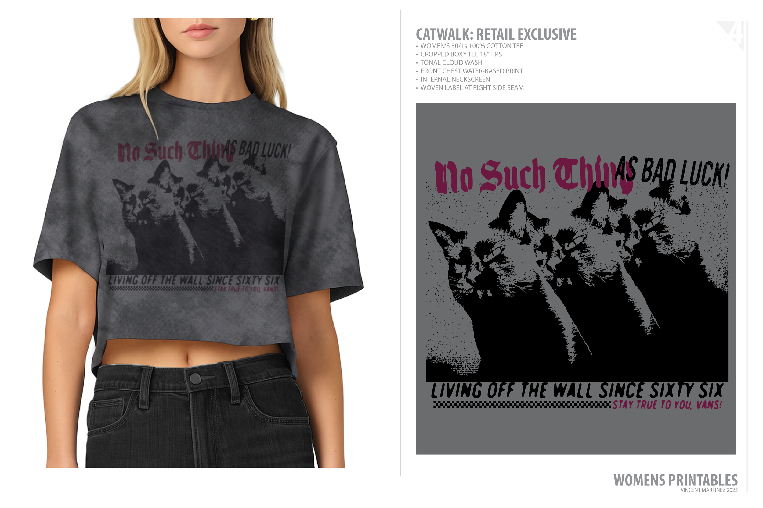
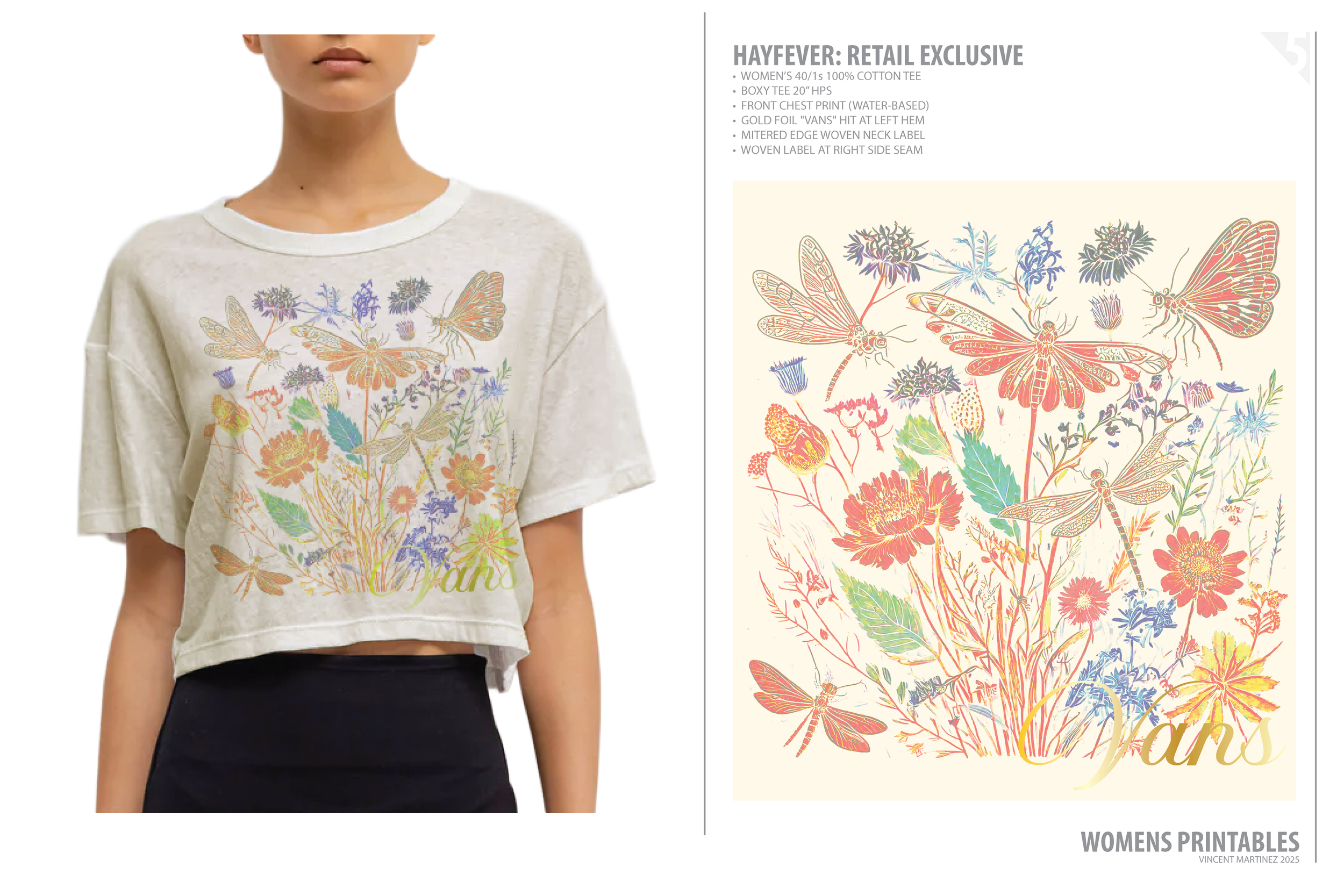
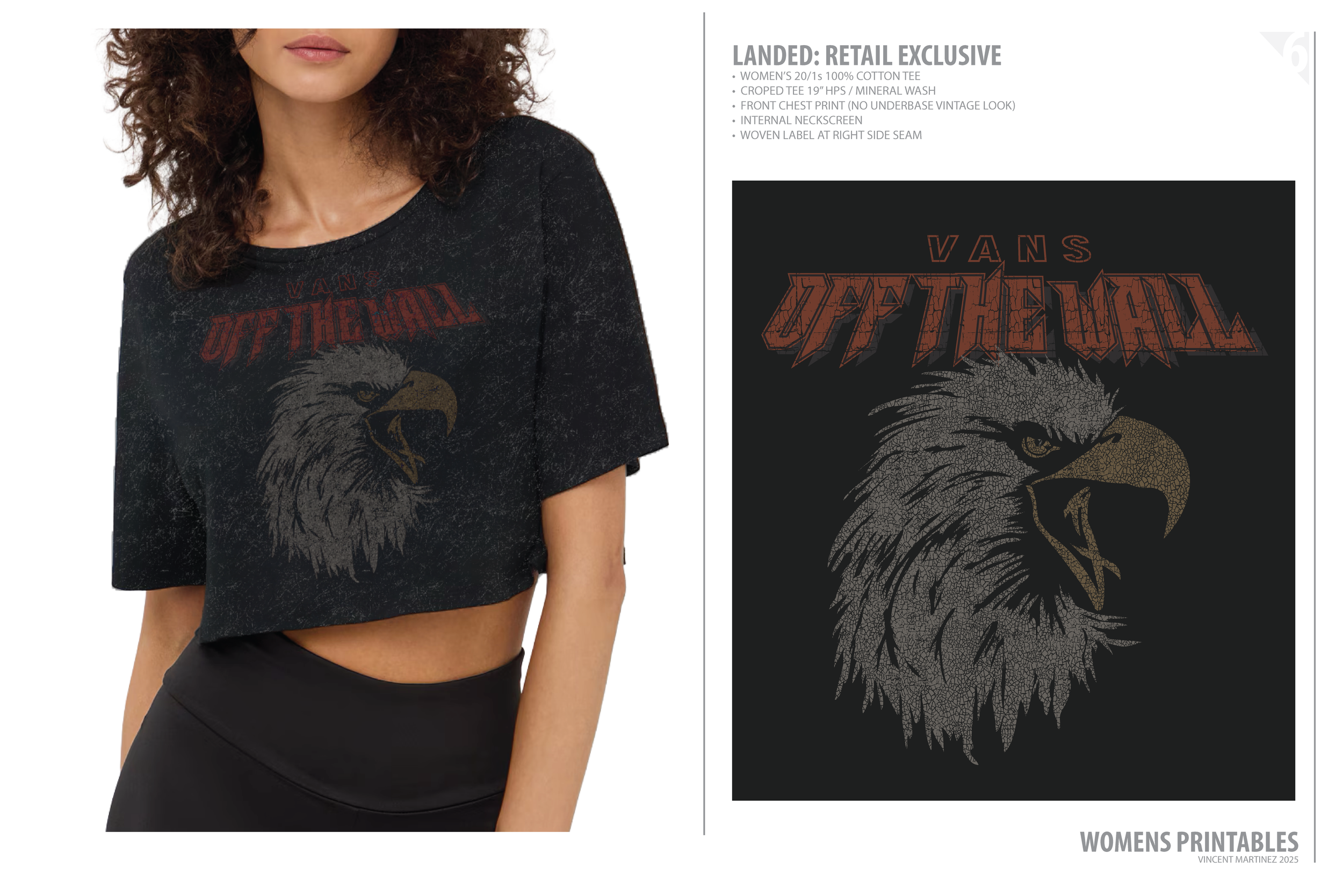
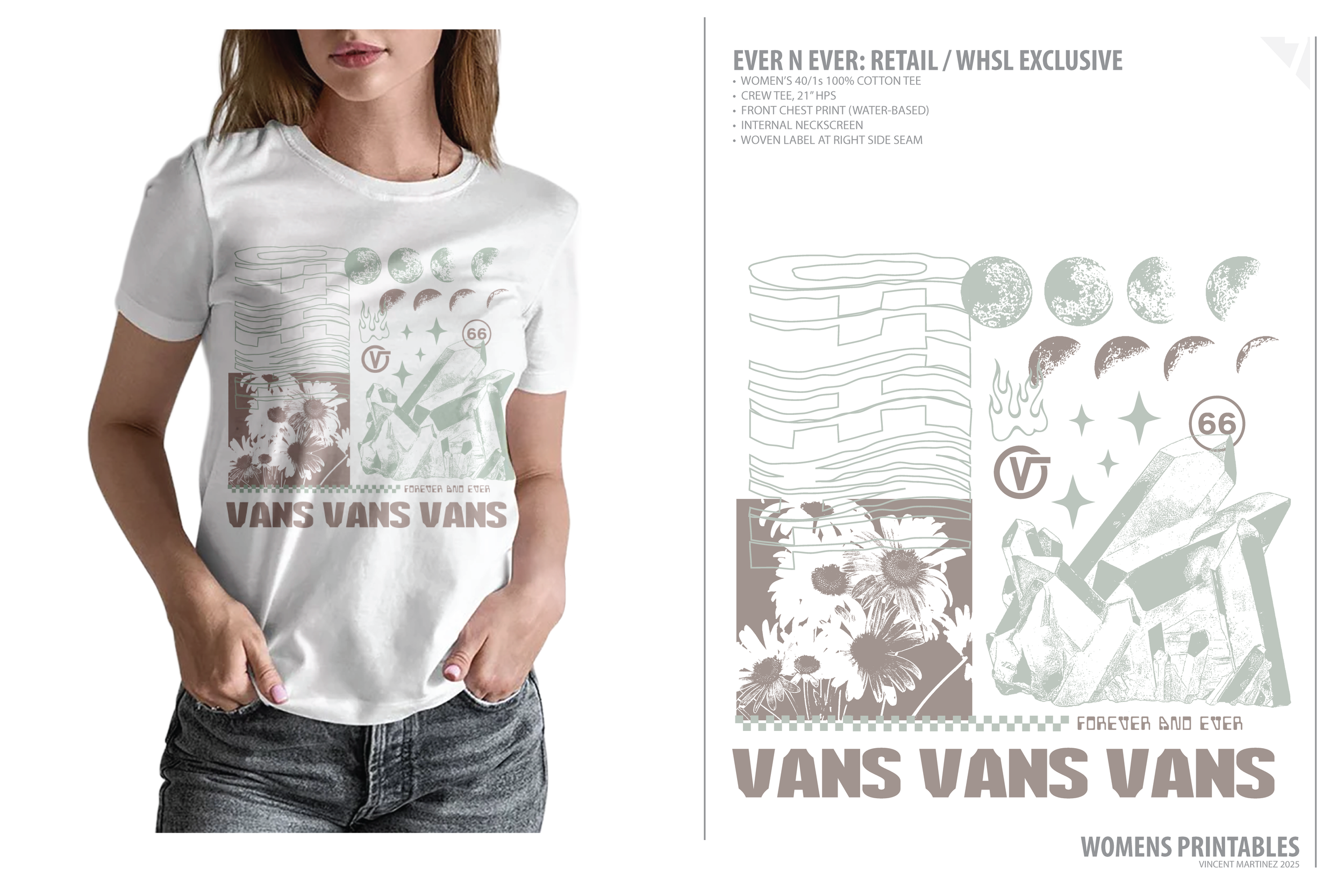
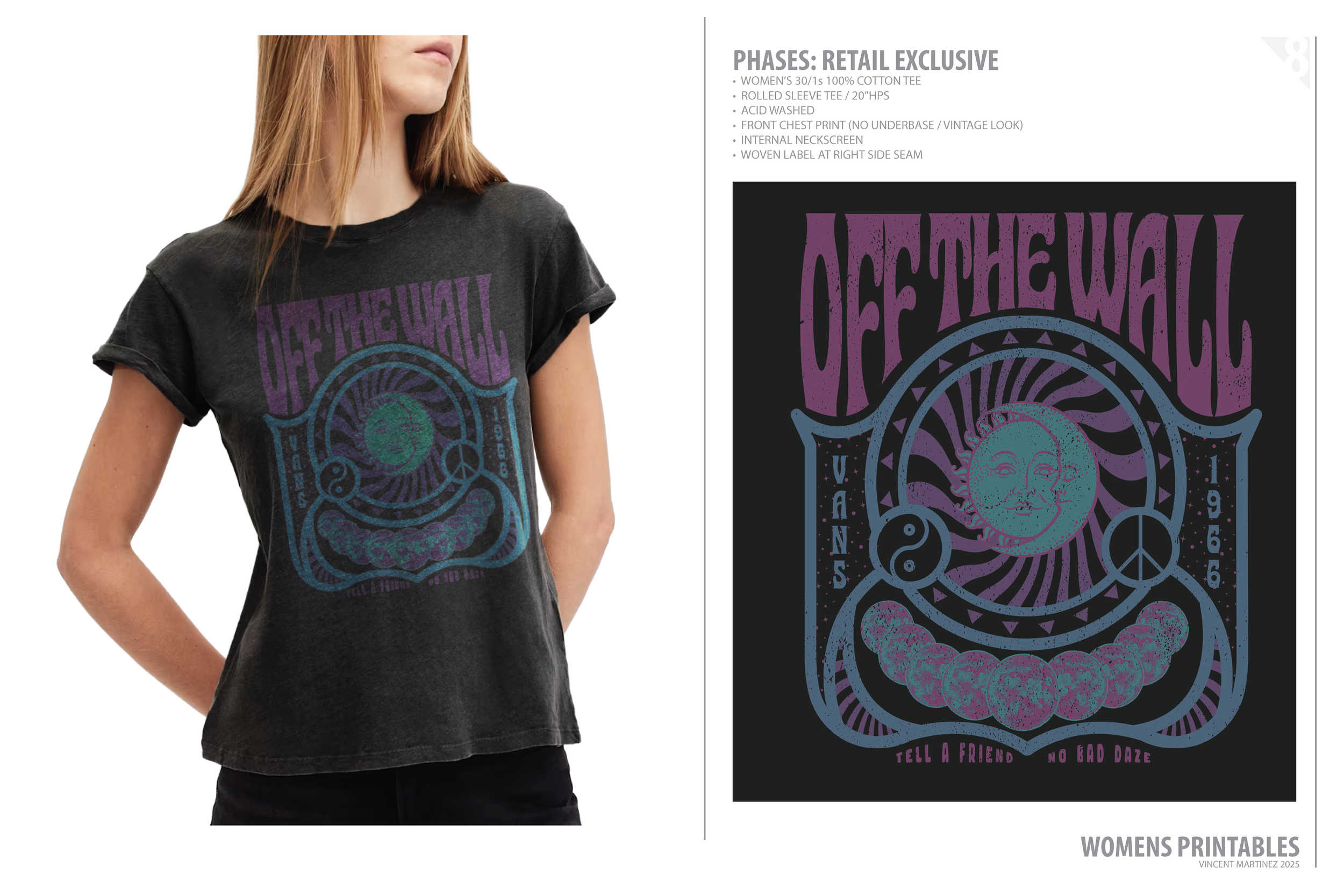
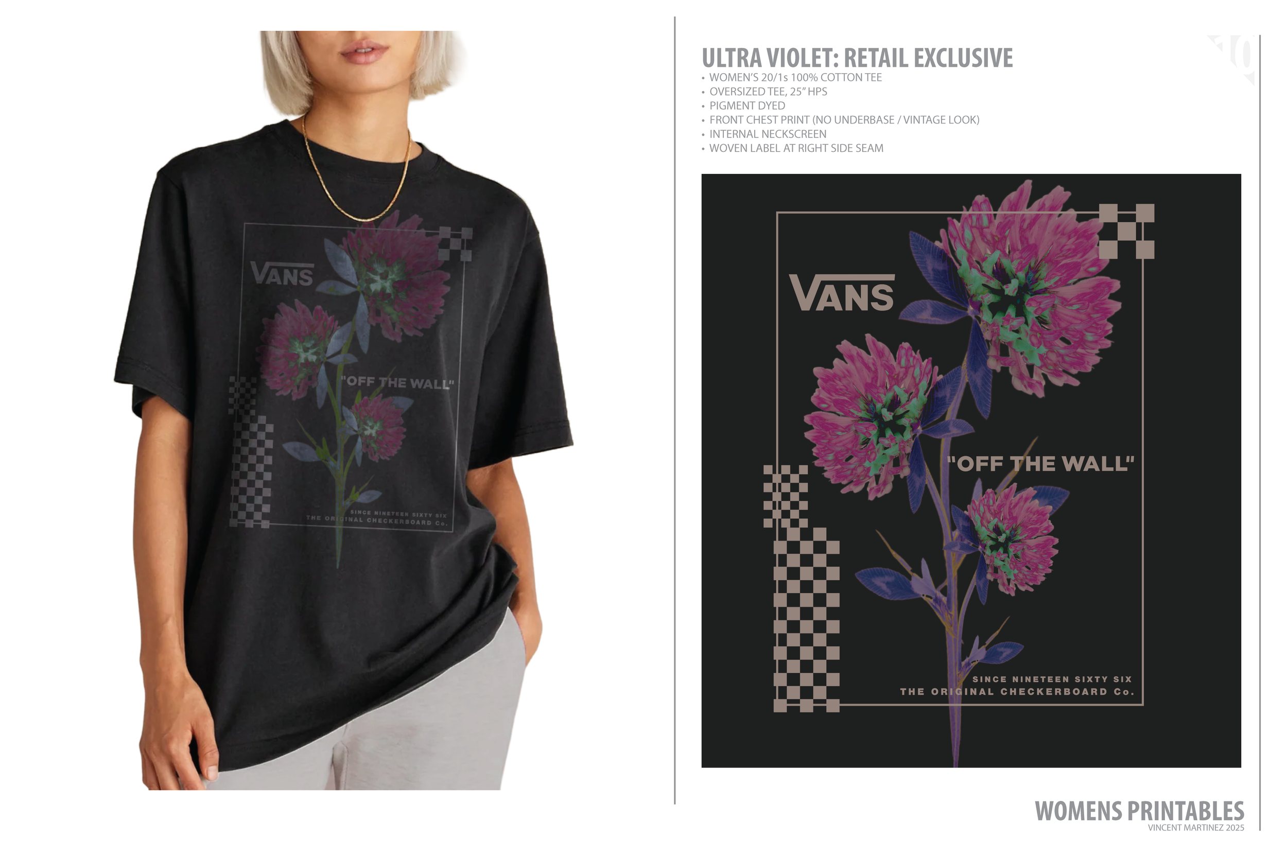
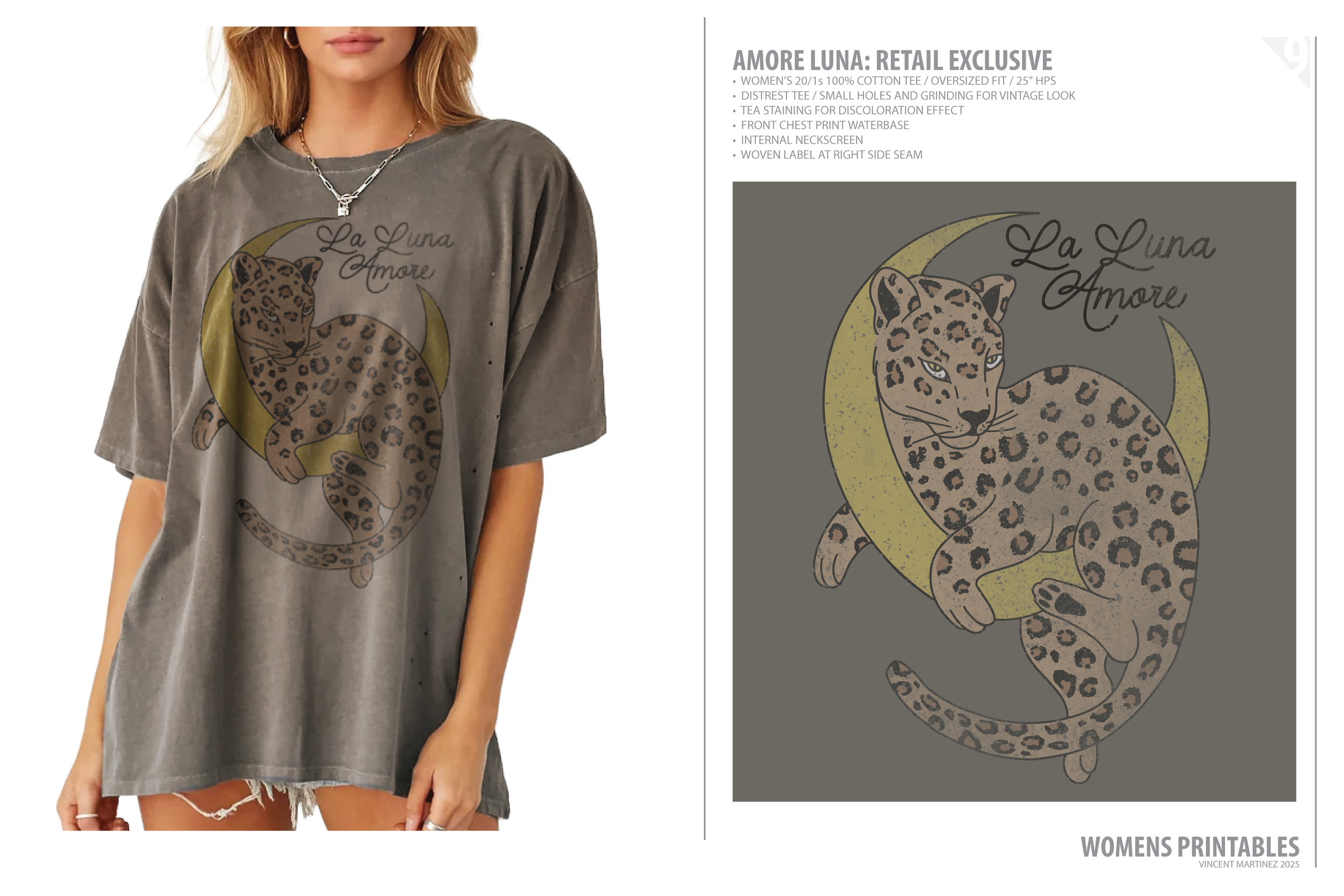
Here’s a curated selection of graphics that go beyond just graphic placement. Some push scale, some integrate embroidery, and others lean into technique—but all were designed to integrate seamlessly with silhouette and fabric, built to live in rotation, not just make a statement.
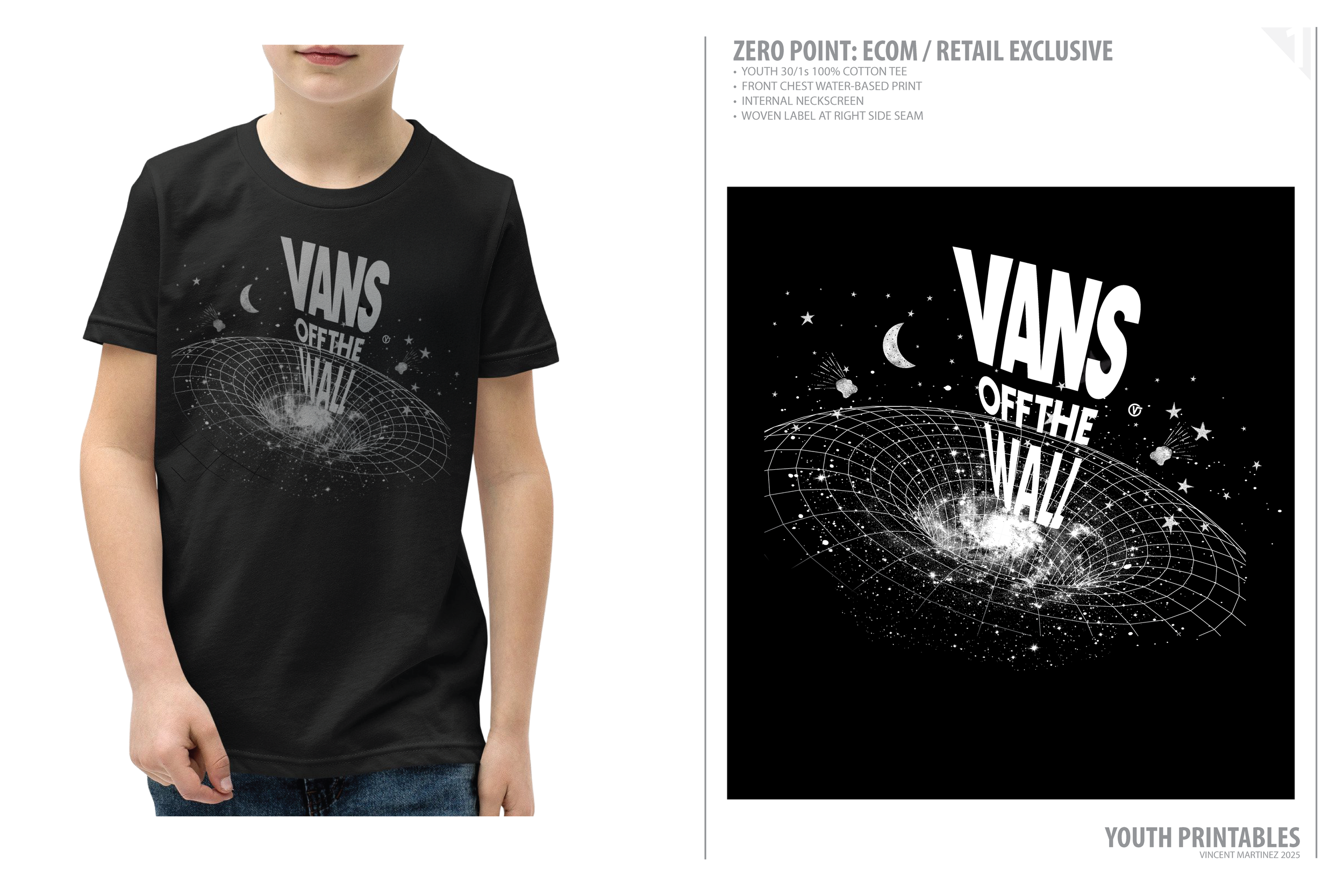
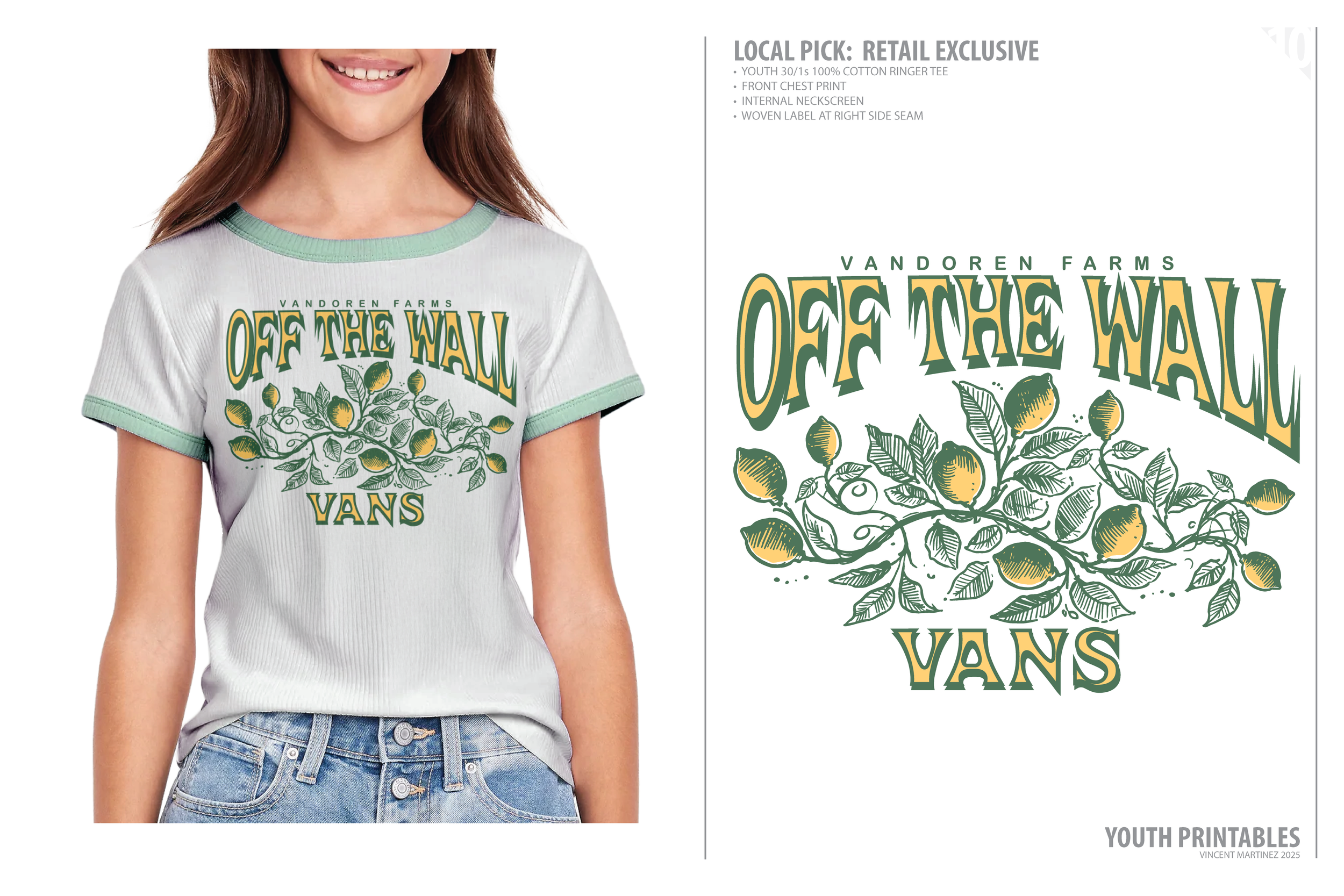
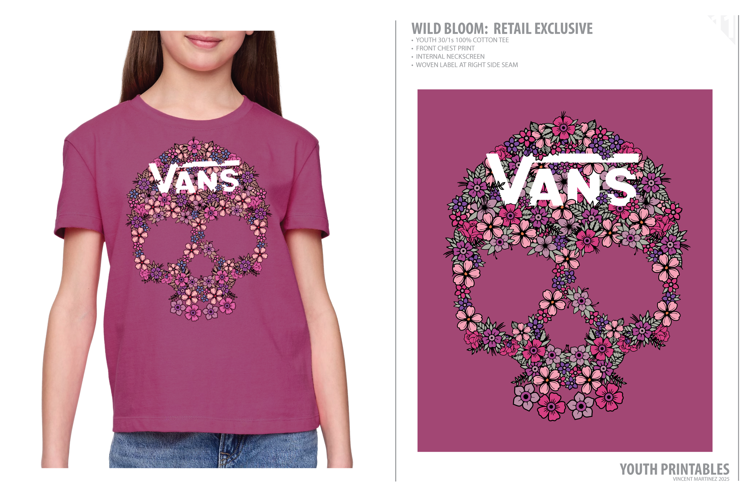
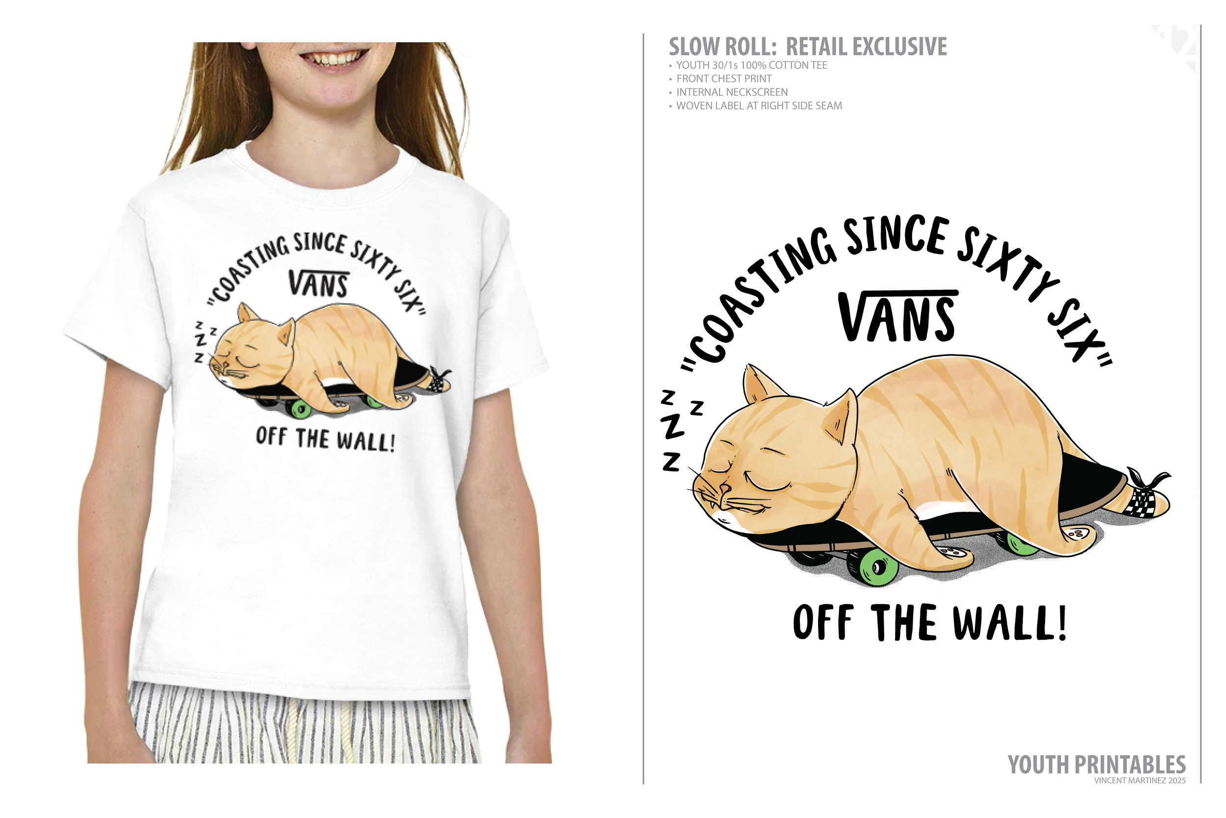
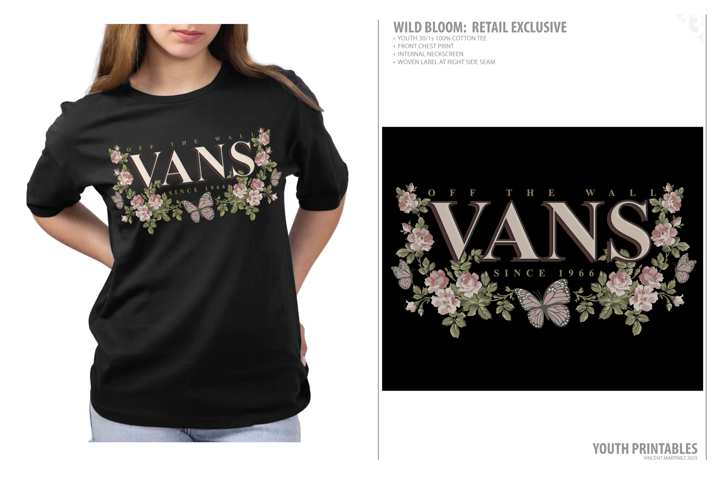
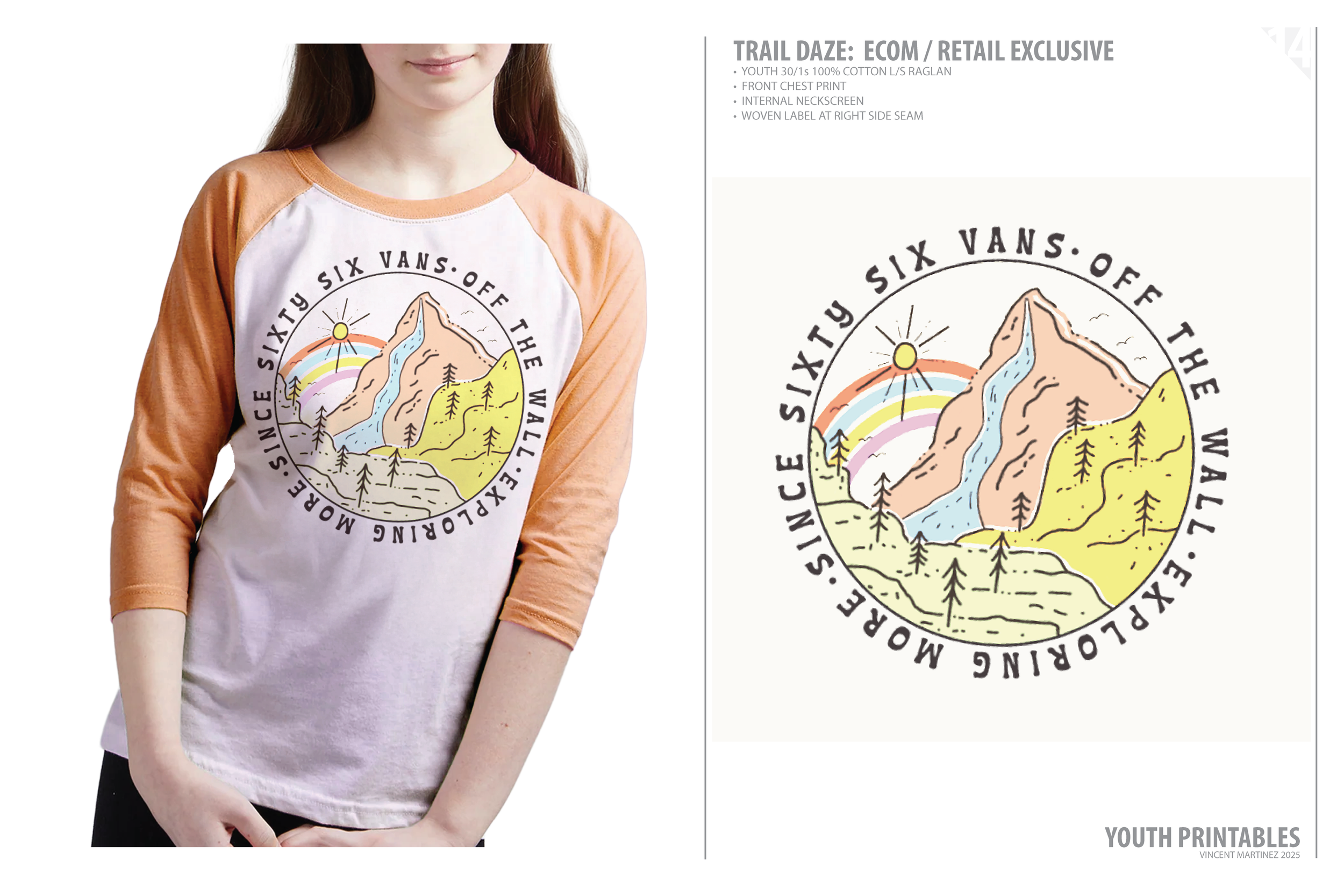
Built for curious minds, busy days, and everything in between, this youth collection leans into graphic storytelling that’s bold, playful, and never too precious. Some prints lean loud, others land soft—but all were made to show up in the moments that matter most.
These aren’t just graphic tees—they’re tiny test drives for big self-expression.
Made for future doodlers, dreamers, rebels, and designers.
Because the best style starts when you’re still figuring it out—and that’s the fun part.
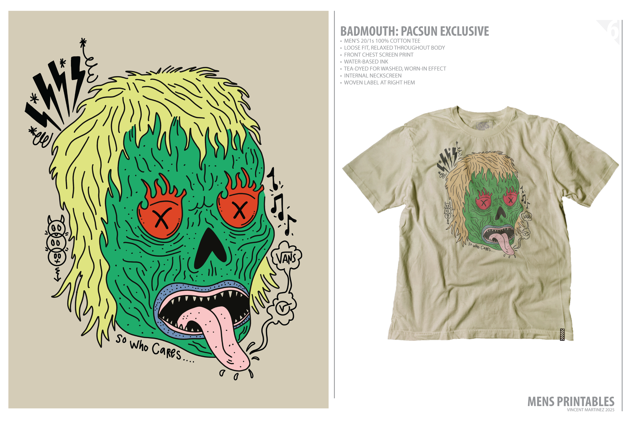
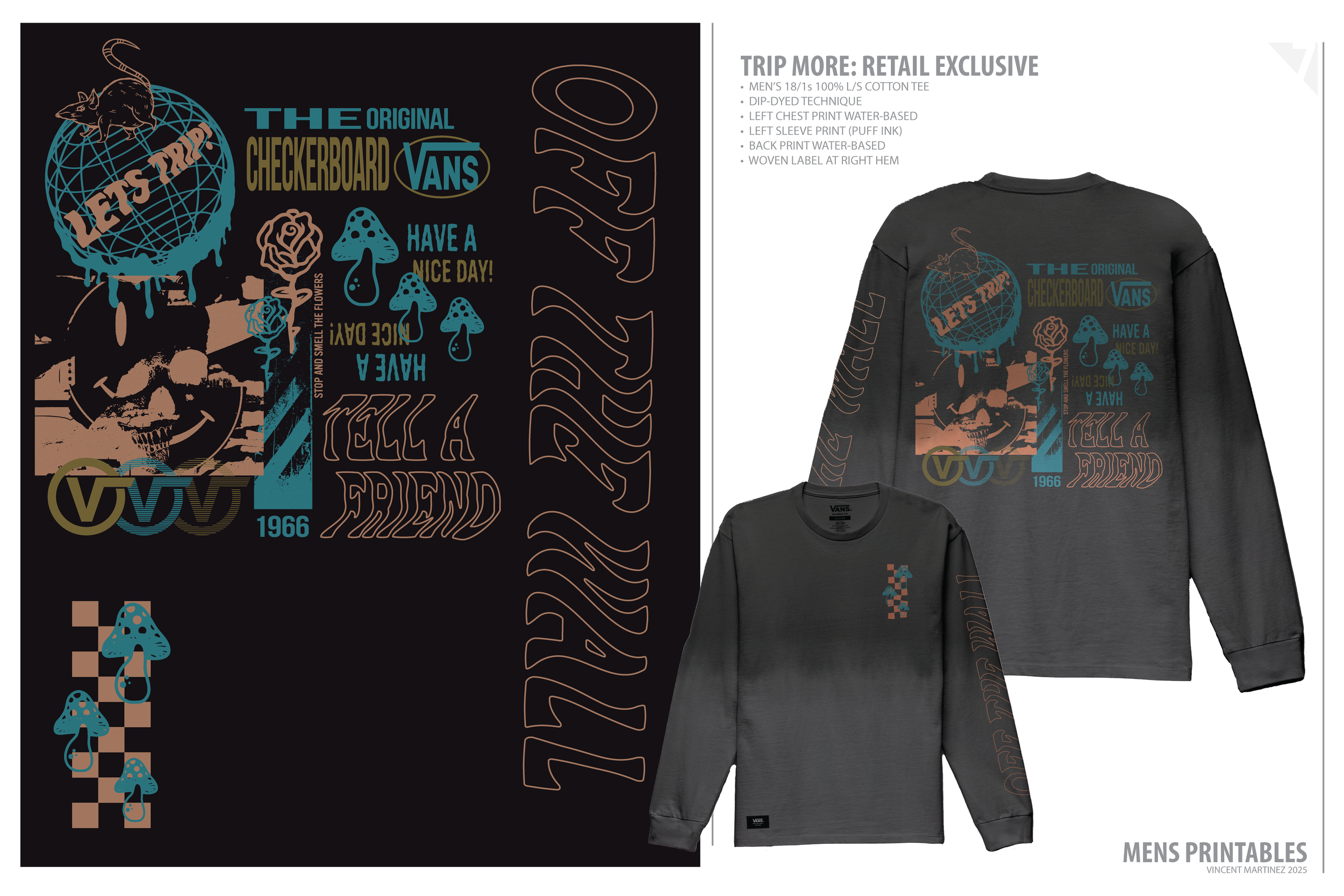
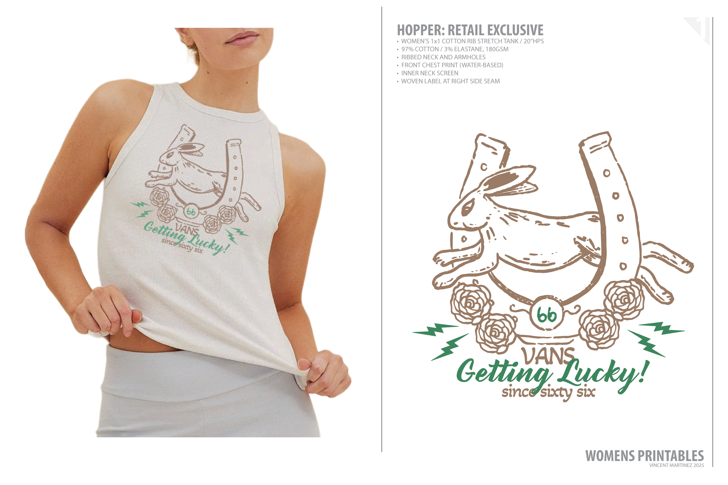
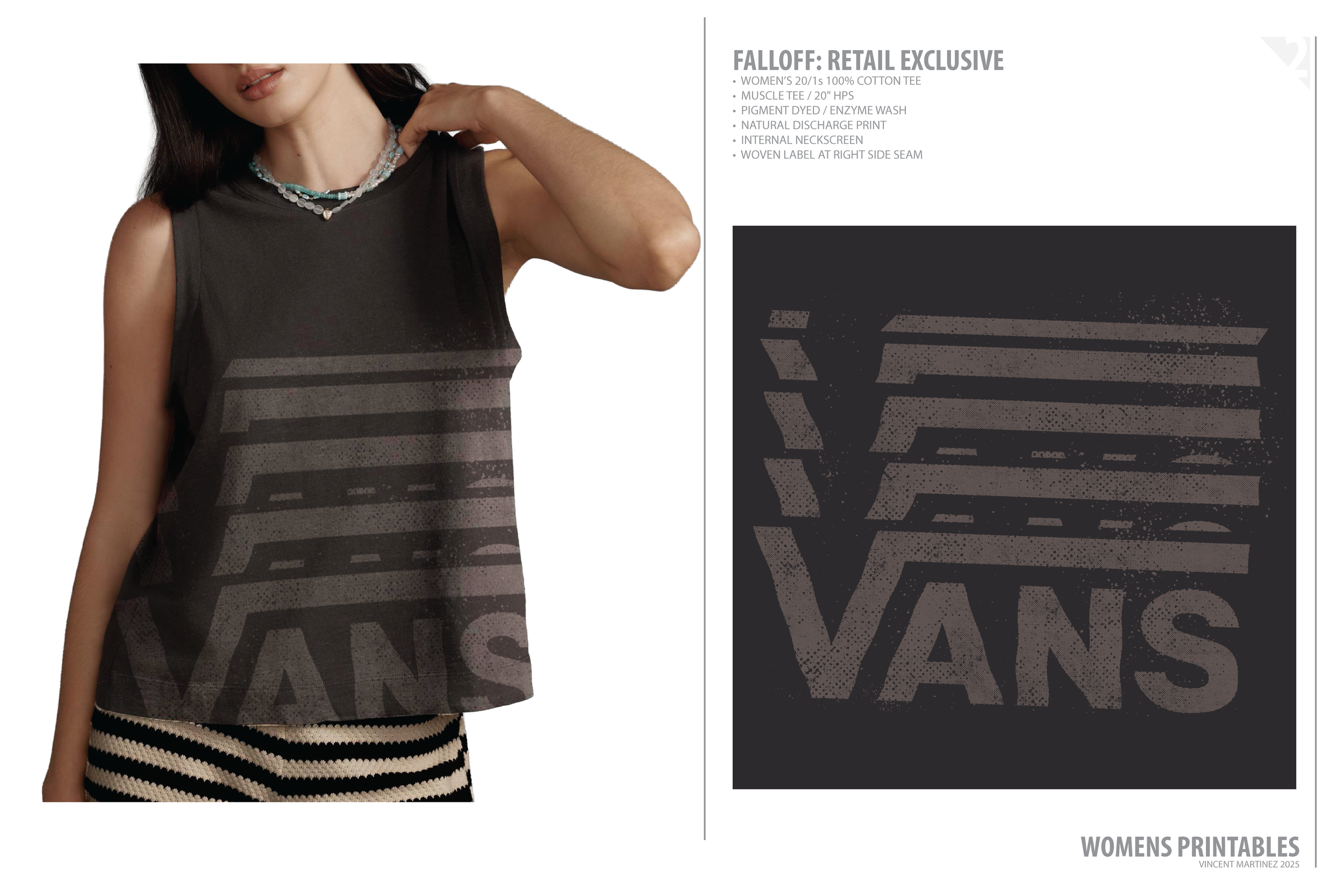
Prints, placements, and purpose—each design tells a story.
Some echo tradition, others bend the rules.
From reworked plaids to offbeat repeats, every pattern was built with intention—
to bring texture, feeling, and character to the surface.
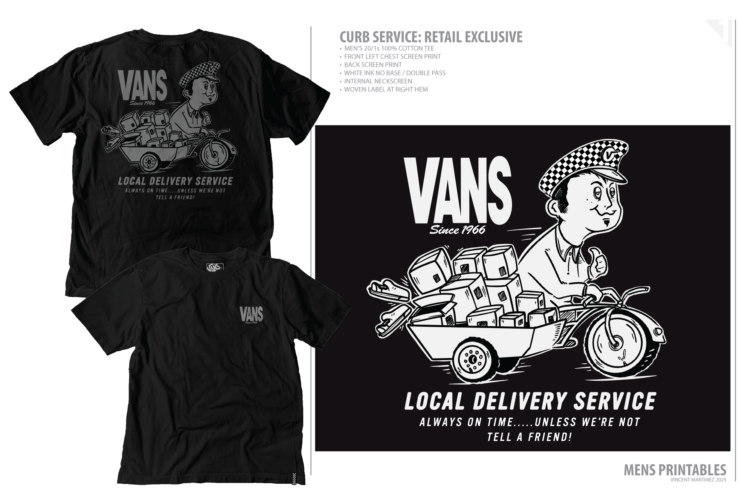
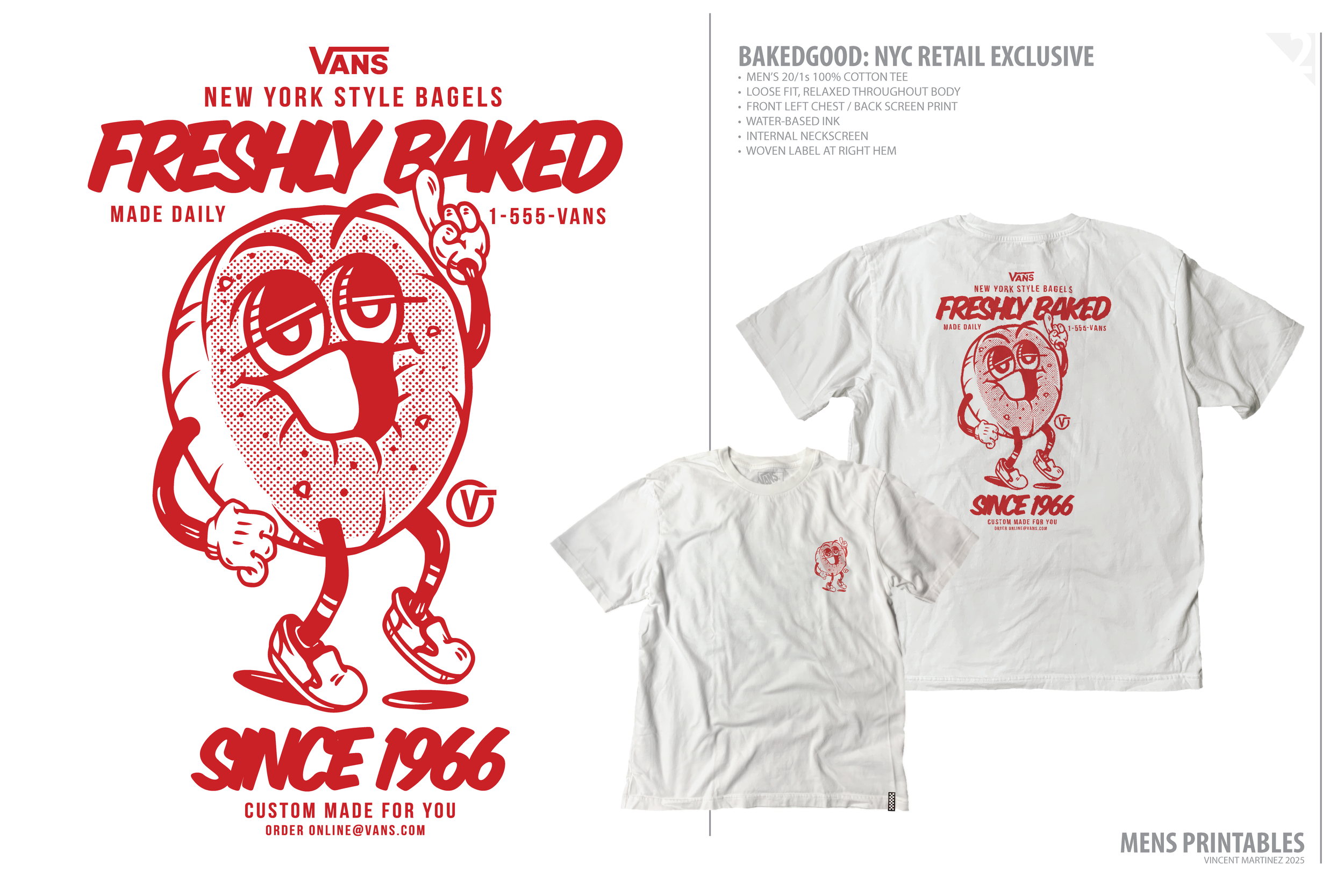
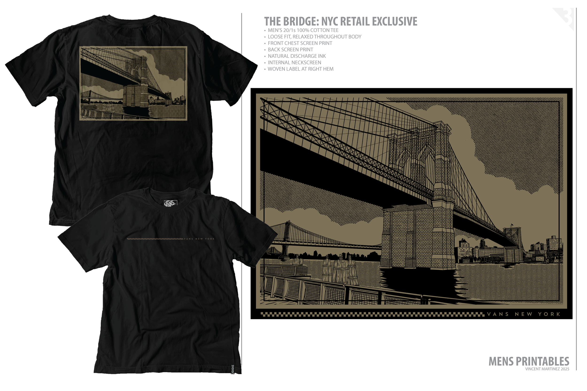
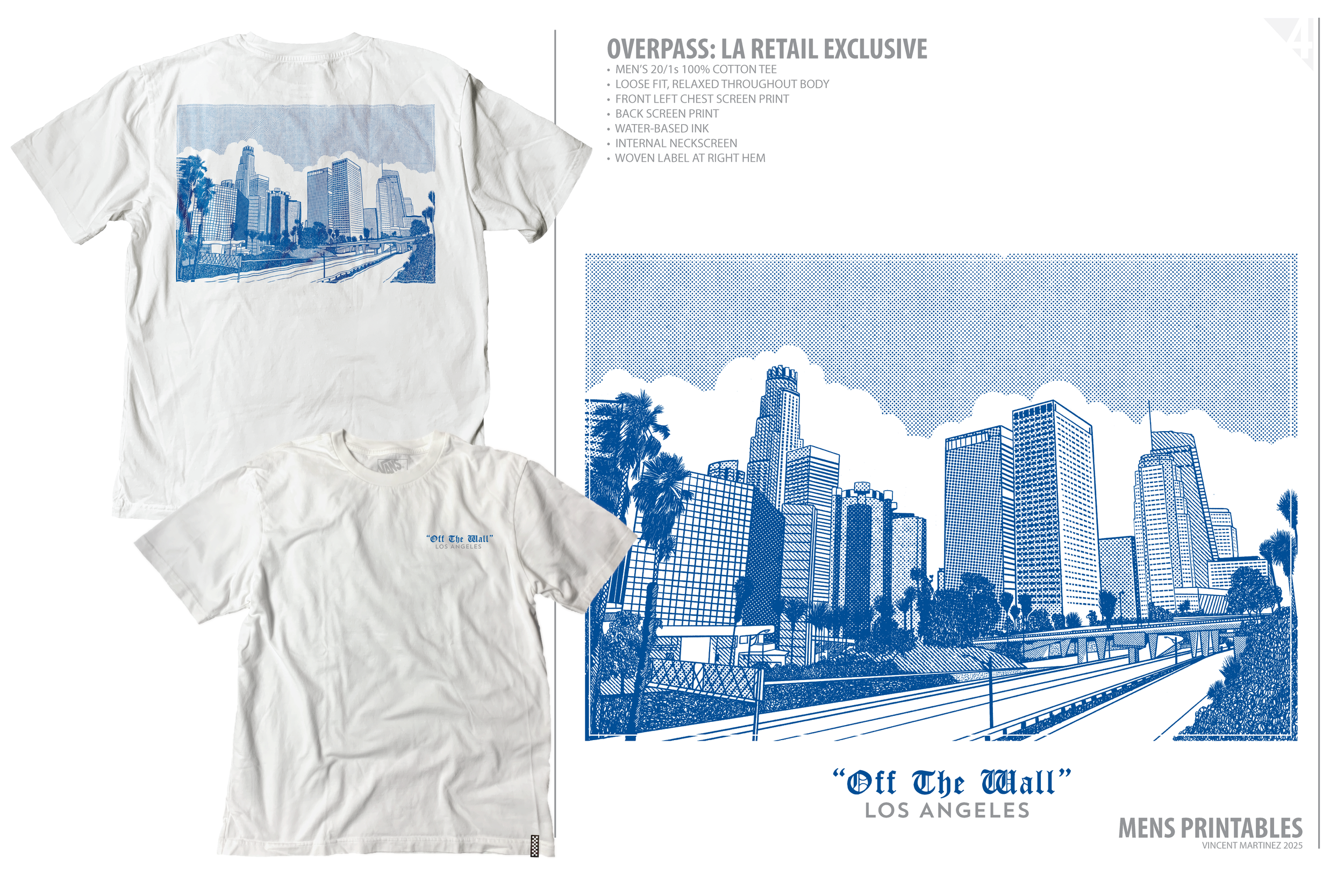
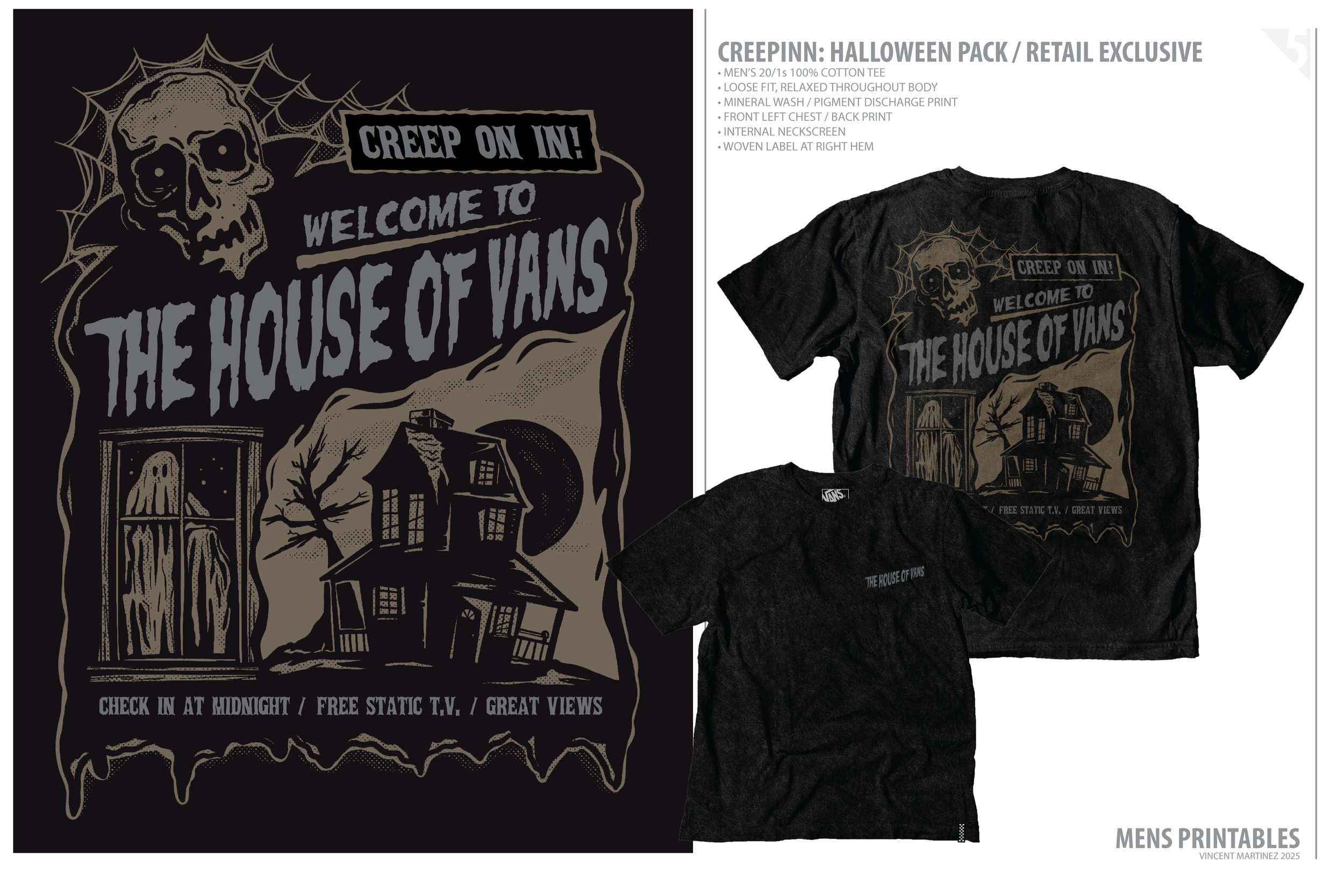
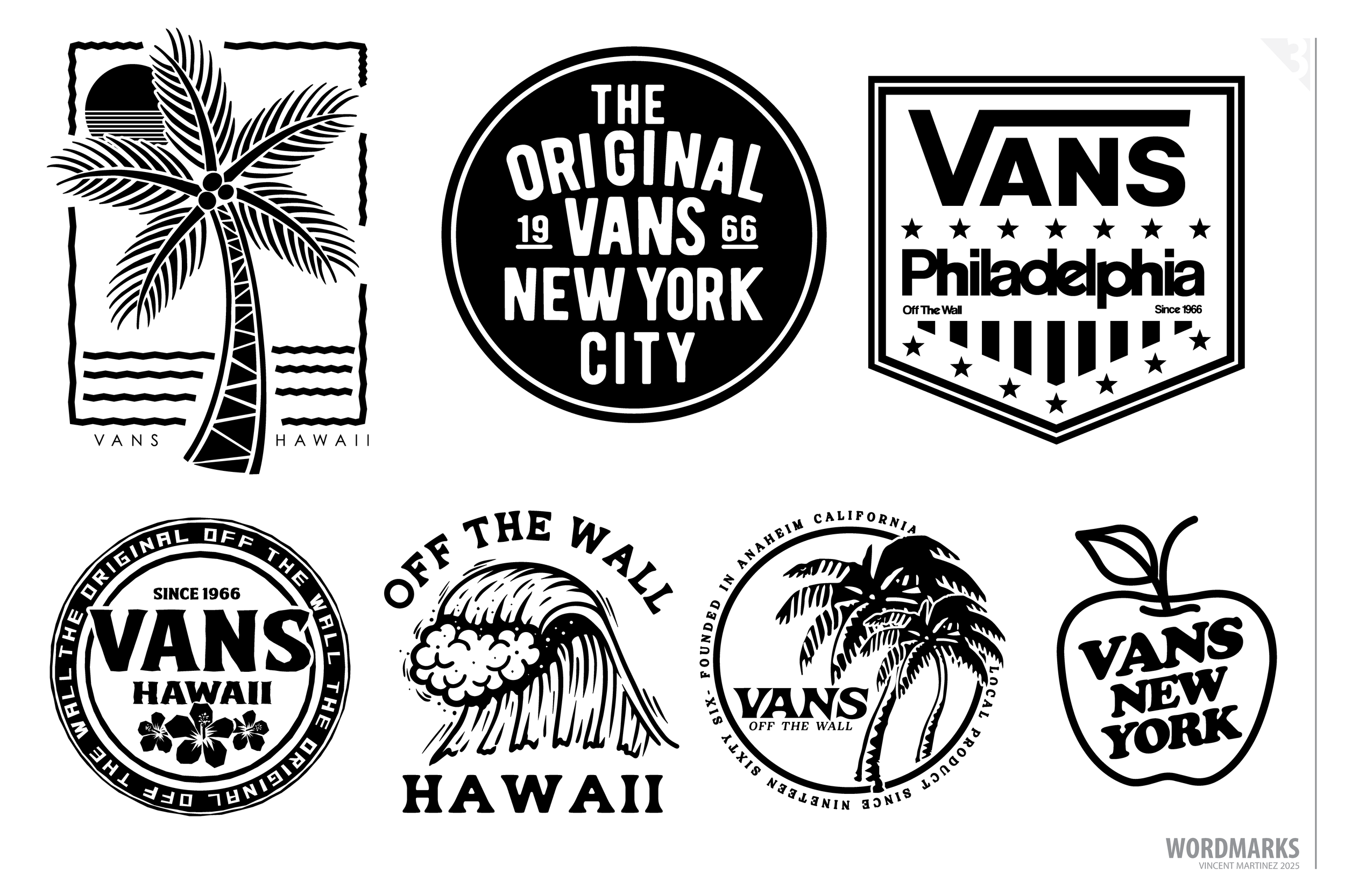
Custom letterforms, lockups, and branded type—built with intent, explored through variation.
This page is a study in type-driven storytelling. From custom scripts and checkerboard badges to location-based lockups, each mark explores how typography can carry brand identity across categories, formats, and eras.
Some are built from scratch, others evolve from core marks. All were developed with a focus on structure, hierarchy, and voice—with room to experiment and refine.